Condor Growth

Condor Growth is a digital marketing agency with deep expertise in brand development, public relations, data analysis, and conversion rate optimization, with extensive experience in the health and wellness industry. They combine strategic insight and bold creativity to take on challenges, achieve the unexpected, and deliver meaningful growth for their clients.
This project focused on full brand development—crafting a vibrant brand identity and a streamlined landing page that serves as their calling card, capturing their mission of “doing the impossible” and connecting with wellness-driven businesses.

SERVICES PROVIDED:

Brand Development
Website Design
Art Direction

INDUSTRY:

Advertising & Marketing (Business Service)
Two business cards for Condor Growth with an orange background. The front is a logo on black ground, and back is white with name and information on white.
Logo of Condor Growth featuring stylized wings and a condor head, with elegant typography on a soft beige background.
Color palette showcasing six shades with their corresponding HEX, RGB, and CMYK values, color names for each color for Condor Growth.
Two smartphones on a blue background display content from Condor Growth’s website.
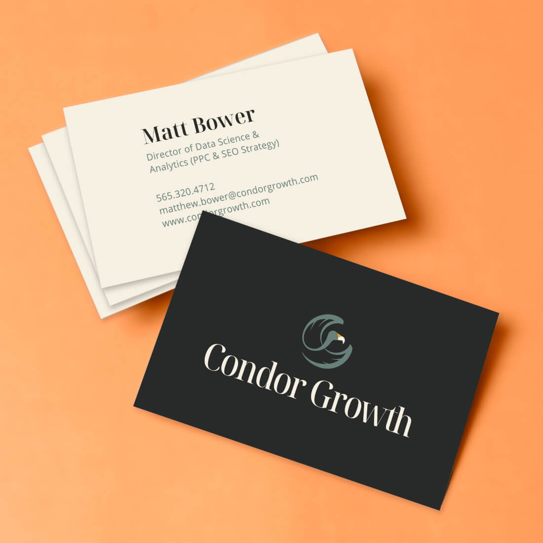
The project included refining the brand name within the constraint of incorporating “Condor” to ensure strong brand recognition and uniqueness.
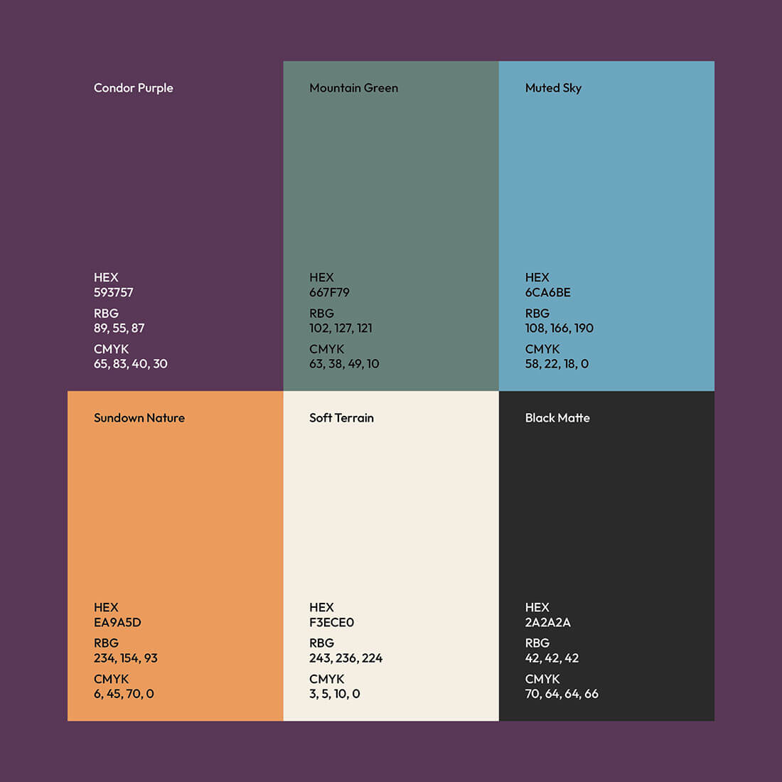
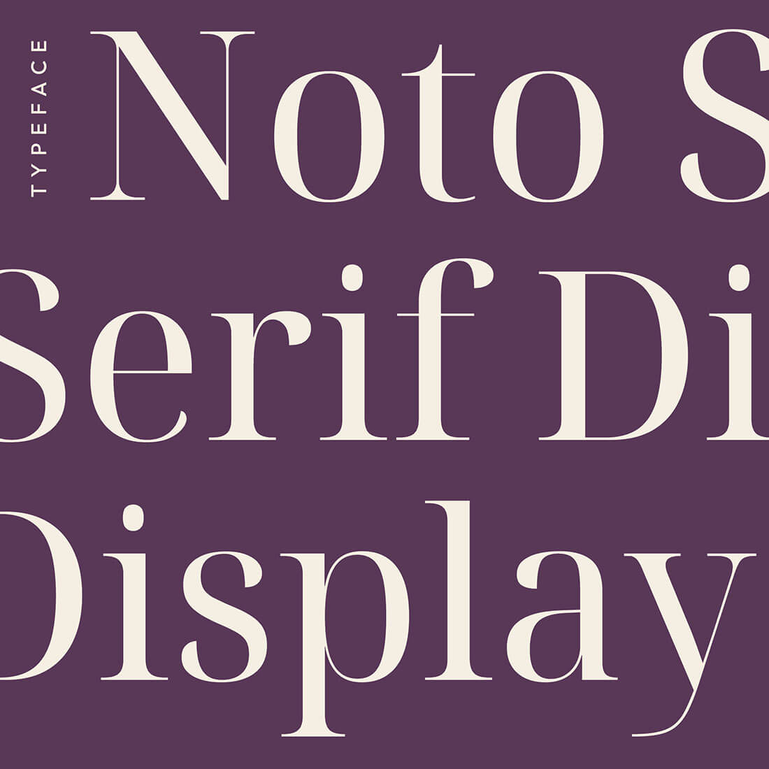
The logo design evolved through collaborative feedback, resulting in a clean, energetic mark rooted in the founder’s preferred color palette. The comprehensive brand development process included defining typography, color palette, and brand tone—compiled into a practical style guide for consistent application across all materials.
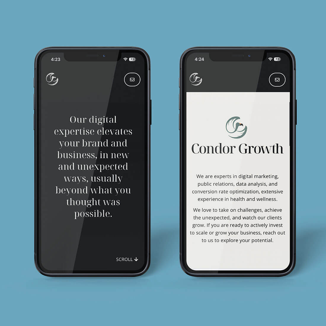
For the website design, wireframes were created to support intuitive navigation and clear conversion paths. The final site features a minimal design, is responsive, fast-loading, SEO-optimized, and includes prominent calls-to-action and easy contact options.
A woman holds a laptop displaying a message about enhancing brand and business using digital expertise, set against a neutral background.
Stylized text showcasing the "Noto Serif Display" typeface on a deep purple background.
The brand identity embodies Condor Growth’s ethos of “doing the impossible,” symbolizing how the company helps clients take flight like a condor—soaring with strength and vision. The circular element around the condor represents the holistic, 360-degree approach Condor delivers, encompassing all aspects of growth and success.
The simple and clean website design complements this by highlighting Condor’s strength in personable face-to-face communication, authentic voice, and relationship-driven referrals.
Together, these elements create a cohesive and compelling brand presence that supports growth, trust, and lasting connections in the health and wellness marketing space.

Credits:
Copywriting – Greg Iorio
Web Developer – Jack Wong

Illustration of a sliced fruit with a yellow interior, orange seed, and green leaf on top, resembling an abstract of lucuma, a Peruvian fruit.

Working with Veronica on the Condor Growth brand was energizing from start to finish. She really took the time to understand who we are and what we stand for, and the logo she created reflects that perfectly. It’s bold, clean, and carries the spirit of what we do.

Veronica was collaborative, creative, and kept us moving forward, which made the process feel easy and focused. She helped shape more than a look, she helped shape a brand we’re proud of. We couldn’t have asked for a better partner.

Greg Iorio
Founder & Principal – Condor Growth